Opening Statement
Many businesses treat landing pages as simple introductory pages. They feature a headline, images, product descriptions, benefits, a registration form, a call-to-action (CTA) button, and perhaps some customer logos.
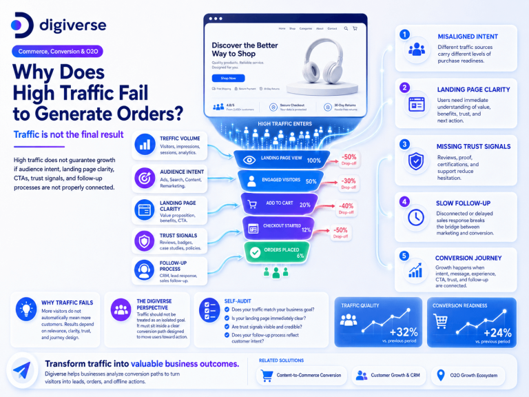
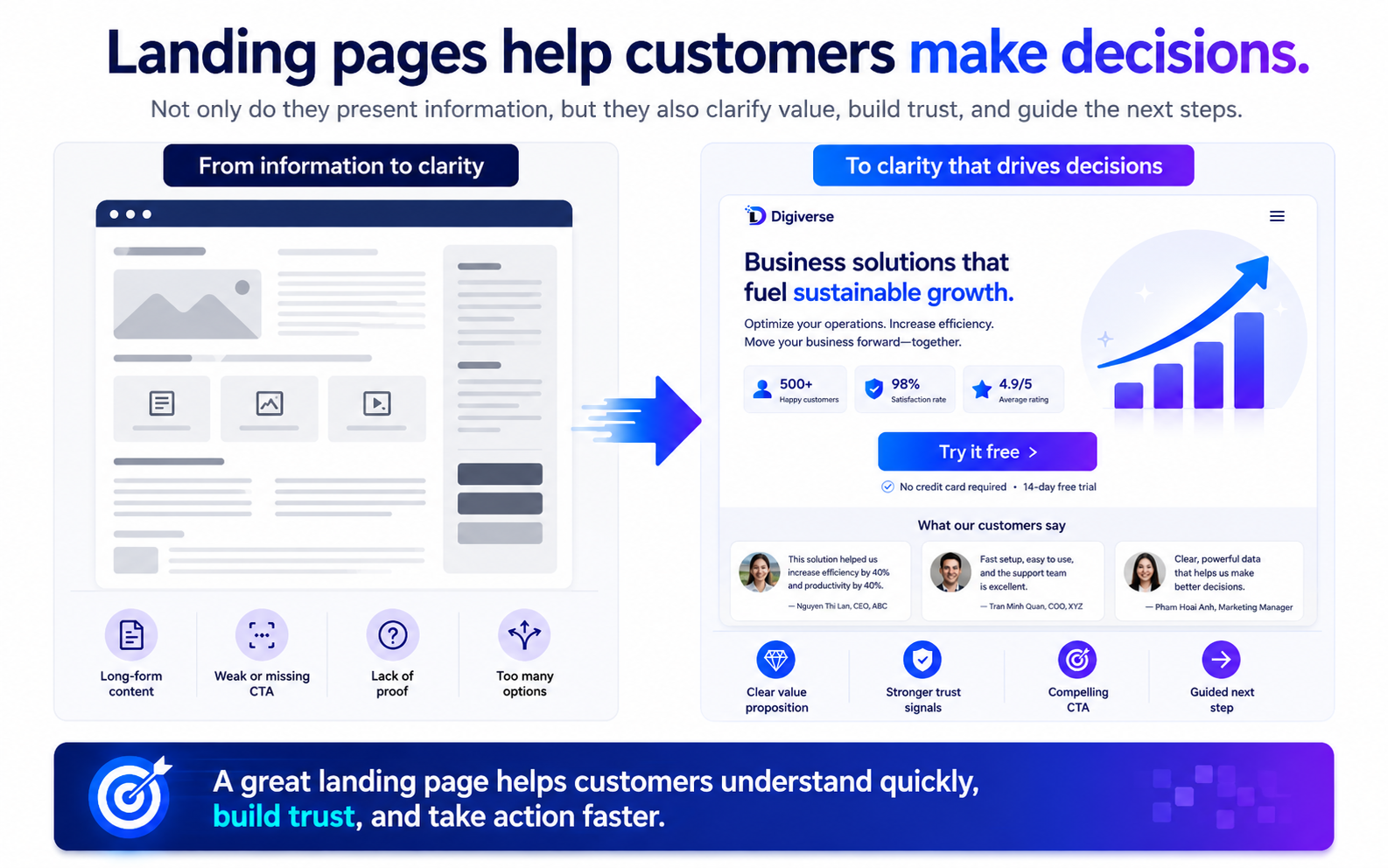
However, a landing page is not just a place to store information; it is where customers decide whether to move forward. A beautiful page without clear value will struggle to convert. A page with too much information but no structure will confuse the customer. A page with a CTA that fails to address key concerns will cause the customer to stall. A page that generates traffic but lacks credibility will increase your acquisition costs.
An effective landing page must create clarity. Customers need to understand what the brand offers, who it is for, which problem it solves, why it is trustworthy, and what they need to do next.
Why is this important?
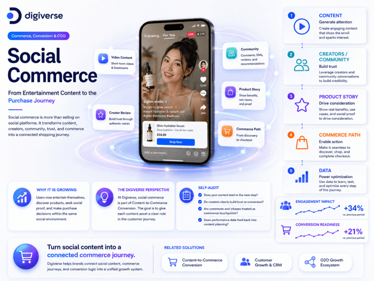
Landing pages often sit at a critical juncture in the customer journey. Customers arrive from various sources: ads, social media posts, emails, videos, creator reviews, search engines, event QR codes, or referrals.
At that moment, the customer has achieved a certain level of attention. However, attention is not enough to trigger action. A landing page must transform attention into clarity. If the page fails to do this, the customer will leave. Many campaigns do not fail at the ad or content level; they fail at the conversion point because the landing page is not clear, not credible, or not easy to act upon.
What is changing?
1. Customers have less patience for vague information Customers do not want to spend time trying to figure out what a business is offering. They need quick answers to key questions: What is this? Who is it for? What problem does it solve? How is it different from other options? Is it credible? What should I do next? The landing page must answer these questions in a clear order.
2. Landing pages must align with the traffic source If a customer clicks an ad promising a specific benefit, but the landing page speaks too broadly, they will feel a disconnect. If a video introduces a specific issue, but the landing page fails to explain it further, the journey is broken. The landing page must fulfill the promise made by the preceding content or ad.
3. Social proof is becoming increasingly critical Customers are becoming more cautious. They require evidence before providing personal information or making a purchase. This proof can take many forms: reviews, case studies, data, certifications, real photos, transparent processes, customer stories, partner logos, or explicit commitments. A landing page shouldn’t just claim the brand is good—it must give customers a reason to believe it.
The Digiverse Perspective
At Digiverse, we believe an effective landing page requires five clear layers:
-
Clear Core Message: Customers must understand the value proposition immediately upon landing.
-
Alignment between Problem and Solution: The page must demonstrate that the brand understands the customer’s pain and has a fitting solution.
-
Credible Proof: Content must include facts, reviews, case studies, or concrete demonstrations.
-
CTAs matched to readiness: Not every customer is ready to buy immediately. Some may need a consultation, a resource download, a calendar booking, or a chat session.
-
Drop-off Analytics: Businesses need to know where customers leave and which sections require optimization.
Implementation Framework: 6 Steps to Building a Clearer Landing Page
-
Step 1: Define the goal. Is the page intended for lead generation, sales, event registration, booking consultations, downloading documents, or product introductions? The goal dictates content structure, CTAs, and necessary data tracking.
-
Step 2: Write a headline based on the primary value. Avoid generic headlines. State clearly what the customer gets or which problem is solved. A good headline lets customers know immediately if the page is relevant to them.
-
Step 3: Arrange content by decision-making logic. Follow a natural flow: Problem → Solution → Benefits → How it works → Proof → FAQ → CTA. Do not dump information on the page without prioritization.
-
Step 4: Place evidence near points of hesitation. If customers worry about effectiveness, provide a case study. If they worry about reliability, show certifications. If they worry about implementation, show the process. Evidence should appear right where it is needed, not just at the bottom of the page.
-
Step 5: Design CTAs based on readiness levels. For ready buyers, use “Register,” “Buy,” or “Book Now.” For those still considering, use “Download,” “Watch Demo,” “Chat,” or “Read Case Study.” Good CTAs help customers move forward without feeling pressured too early.
-
Step 6: Measure and optimize based on behavior. Track page views, scroll depth, CTA clicks, form completion rates, exit rates, traffic sources, and lead quality. Optimizing a landing page is a continuous process, not a “set-and-forget” task.
Implications for Vietnamese Businesses
In Vietnam, many businesses use ads, social media, TikTok, Zalo, or creator marketing to drive traffic to landing pages. However, these pages often struggle with generic messaging, unclear CTAs, overly long forms, lack of social proof, or a lack of alignment with the ads leading to them. This results in high media costs without a proportional increase in conversions.
Vietnamese businesses can start by auditing three critical areas: Does the top of the page clearly state the value? Is there sufficient credibility/proof? And is the CTA aligned with the customer’s readiness to act?
Self-Checklist
-
Does the landing page have a clear goal?
-
Does the headline clearly state the primary value?
-
Does the content follow a logical decision-making path?
-
Is the page aligned with the ad or content that led to it?
-
Is there sufficient, credible evidence?
-
Are CTAs matched to the customer’s readiness?
-
Are forms concise and user-friendly?
-
Is there data tracking for drop-offs and ongoing optimization?
If many answers are “Unclear,” your landing page may be presenting information, but it is not creating enough clarity for customers to act.